COVID-19 restrictions imposed in the autumn of 2020 meant that classes had to migrate online from one week to the next. Still students managed to come up with really creative projects , working remotely, collaboratively, filming and documenting their projects. The projects were inspired by Suzanne Jaschko's data cuisine concept. These beautiful projects show the power of food in conveying important information in a meaningful and mouth watering manner.
Enjoy!
Enjoy!
|
France's first confinement and effect on mental health and on behaviour
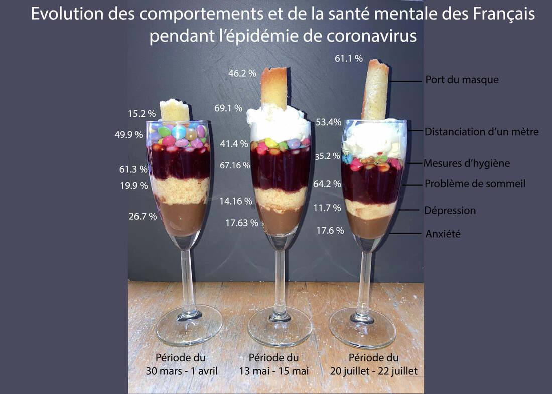
Via her tiramisu shots, Jeanne Le Priellec represented the impact of Covid and the first confinement on people's behaviour and on their mental health in France. The layered tiramisu reflected three key moments: the start of confinement, during confinement and post-confinement. The data showed the impact of economic factors on the mental health of French people and underlined the importance of getting psychological support, especially for people with vulnerability (anxiety, depression, sleep disorders, etc.) during this pandemic period. The video is lively and fun to watch. |
Covid rules: Mask wearing by age group
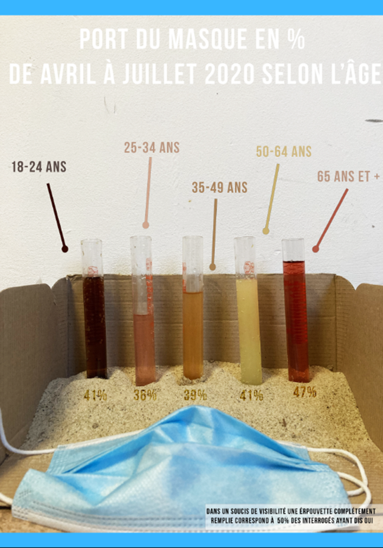
This urban dataviz project shows the wearing of masks according to age. The student made the dataviz with objects already present in his/her apartment. Indeed, the choice of everyday objects was a reminder of our current condition of confinement. According to the student "It was when I found the vials in my closet that I decided to work on this subject because I find that it recreates the medical environment well. I used them to make a bar chart with different coloured liquids in my fridge. I then took inspiration from data cuisine and I proceeded to a graphic design on photoshop. I like the contrast of the raw materials highlighted by digital processing." |
|
Progression of Covid-19 cases in France between June - November 2020
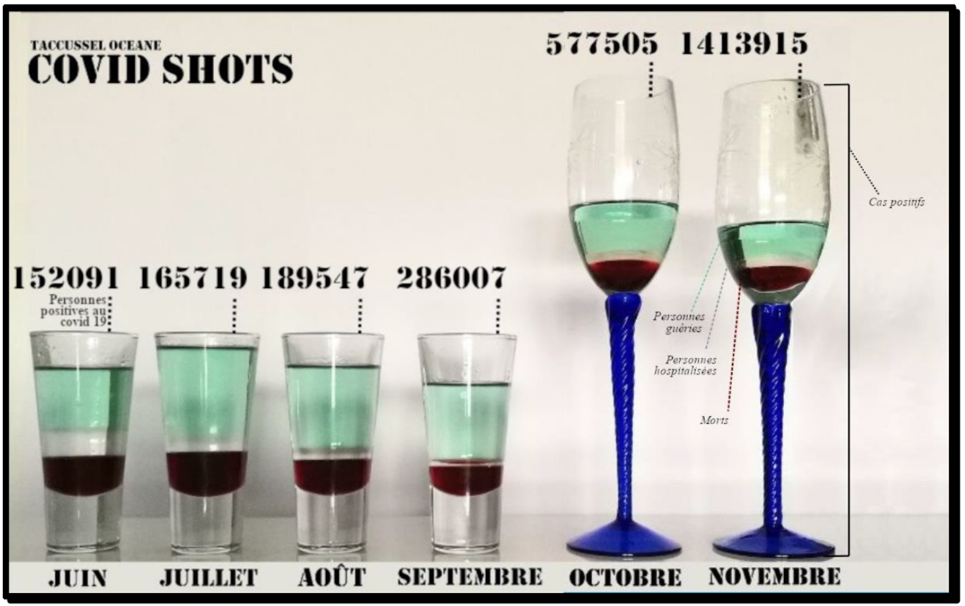
This beautiful artwork entitled "Covid shots" showcased data on the impact of Covid between June and November 2020 in France. The students used liquids of varying density and colour to portray rates of infections, deaths, hospitalisations and recoveries. To achieve a separation between the different liquids, it was necessary to consider their densities and viscosities. The selection of the ingredients and their placement were studied so that the most alcoholic ones were above the sweetest ones, as the latter were denser, and thus allow the stratification of the data. In addition, the liquids had to correspond to colours associated with the data represented to be more visual: - Green colour: Green absinthe. It represents the rate of people cured of COVID 19. The choice of absinthe was made not only for its colour, but also because it is a medicinal plant that was chosen in the trials to produce drugs against the disease. - Transparency: Vodka. This alcohol has a higher alcohol content than Absinthe, which led us to mix it with sugar syrup to make it denser. It represents the rate of hospitalised people. It was chosen to represent the disinfectant alcohol used in medicine. - Dark red/black: Elderberry syrup. Syrup is the densest of the products used to make this visualisation. Moreover, its blackish red colour makes the connection with death. The Elder tree (tree or bark) known to have medicinal virtues in ancient history. |
Distribution of the population by race in Brazil, access to education and to literacy
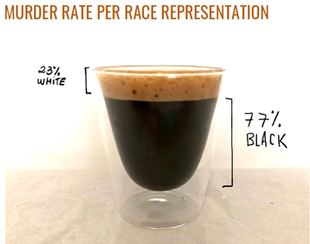
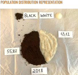
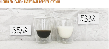
This project was based on data released by IBGE (Instituto Brasileiro de Geografia e Estatística - Brazilian Institute of Geography and Statistics) and IPEA (Instituto de Pesquisa Econômica Aplicada - Institute of Applied Economic Research) in order to represent, Through Data Cuisine, it portrayed the distribution of the Brazilian population by ethnic origines, their access to education and levels of illiteracy and the rates of violence in Brazil. For this Data Cuisine, coffee was used because coffee is one of the most exported products in Brazil. Milk and sugar were also used to represent the different "races". Through this representation we can see that 56% of the population is considered black. The representation of the indigenous population, being only 1% of the population, was not considered in this representation. Representation of murder data in Brazil, where 77% is Black and 23% White, considering the population distribution, it is possible to understand the murder disparity considering the "races", which demonstrates the systematic racism present in the country. Regarding Education, this representation shows that entry into higher education in 2018 was 53.3% for Whites and only 35.4% for Blacks. Note: For the representations, "Black" implies the sum of Blacks and "Browns" (Pardos) in Brazil. |
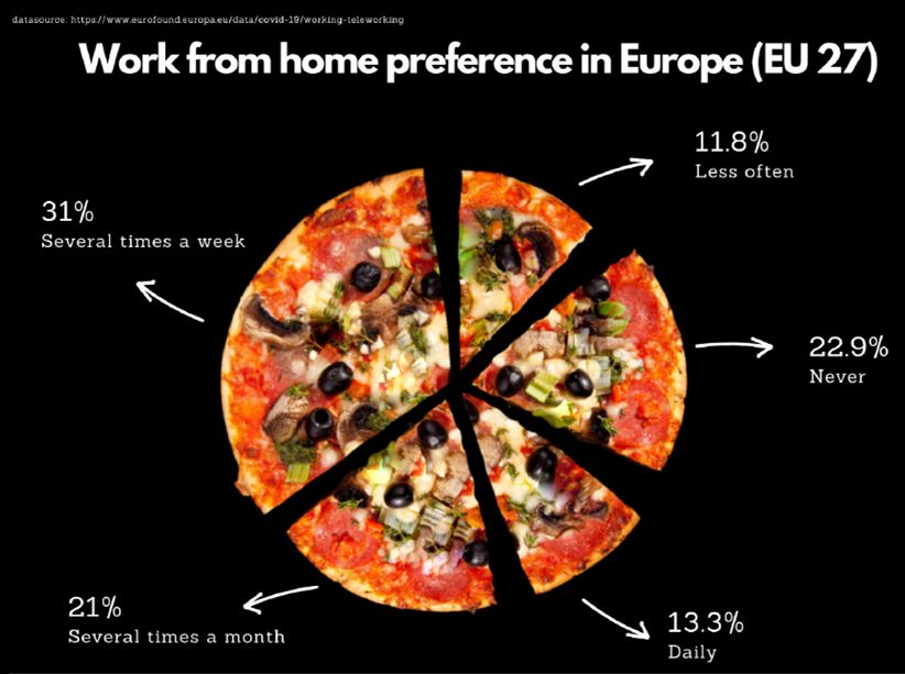
Working from home pizza: European preferencesUsing pizza as pie chart, this mouth watering data cuisine viz shows the preferences of Europeans (EU 27). The data was pulled from the Eurofond survey (as of July 2020) on remote working during the Covid-19 pandemic. The results show that 78% of employees in the survey said they preferred to work from home at least sometimes irrespective of the Covid-19 restrictions. The preferred frequency for working from a distance is several times a week (31%) and only 13.3% say they want to work remotely on a daily basis. Also, 22.9% of respondents do not wish to work remotely.
|
