'Tis the autumn of 2021 and we are still in Covid19 land. Luckily, schools and higher education institutions in France were able to resume in face-to-face mode.
This year's dataviz projects yielded four creative displays, inspired by Suzanne Jaschko's data cuisine and José Duarte's easydataviz. Students worked collaboratively in small groups of 3-4, although some of the design itself was done at home then brought back to the school premises, mounted and displayed for about a week, to enable other students to participate in the data gathering and hence in the results. They filmed and documented their projects which enabled me to bring them to you!
Happy viewing & Bon appetit!
|
Means of payment of French population
This beautiful data cuisine project portrayed the preferred means of payment for online purchases of the French population using data collected from the site ''STATISTA'', a data platform linked to the world's major media companies. The students used three fruits to represent different payments means: raspberry, blueberry and kiwi. A short explanatory video accompanied the display. This video explains in more details how the fruit was arranged in the glasses according to the percentages. 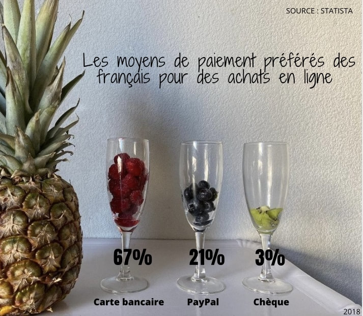
|
Use of psychotropic substances by students
This project shone a light on the types and levels of substance use by students. It is often thought that hard drug use is not widespread or that their use is far from our daily lives. However, many studies have shown that the use of psychotropic drugs is quite widespread on campuses all over the world. The aim of the project was to involve and encourage students at our School to first speak out via their votes, and then to raise awareness about the issue. The urbandataviz project was built using cartons on which various substances were drawn. The display was placed in an area of frequent passage for about a week. The anonymity of the staging enabled passers-by to discreetly vote and indicate if they consumed any of the substances. Four options were given: "hard drugs, soft drugs, cigarettes or no substance". With this dataviz, the students bravely tackled a taboo topic hardly dealt with by University authorities and not at all at the level of individual Departments, Schools and Faculties. Once the voting period had been completed, the resulting dataviz display brought home the fact that there was some level of drug consumption by the students in our School. It's now up to the authorities to do something about engaging students in conversations. 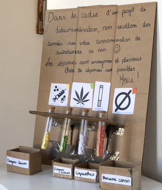
|
|
Time spent on social media and for what?
Social networks remain one of the best ways for students to communicate with each other. They allow them to stay in touch across continents and time zones, and they can also keep in touch with friends who live just around the corner or who can perform professional tasks to fit in with the world of tomorrow. Today's students are surrounded by the internet and digital tools. According to the French daily Le Monde, French internet users aged 16 to 64 spend an average of 2 hours and 22 minutes on social networks. In the spirit of involving students who represent our core target, and involving them in this research, the students took the liberty of proposing Squid Game dataviz version. They took geometric shapes (the square, the triangle and the circle) and coloured them with two different colours: blue representing professional use and green for personal use. The objective was to see: - For what purpose do students use social networks? - How many hours do they stay connected on social networks? The clock was divided into 3 parts: 0 - 4 hours, 4 hours - 8 hours of time or 8 - 12 hours. The dataviz was displayed on the school premises and students invited to put a sticker on the time frame corresponding to their social media consumption. The result as they say is quite "telling". 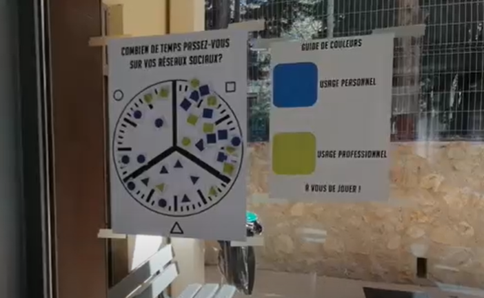
|
Distribution of the population by race in Brazil, access to education and to literacy
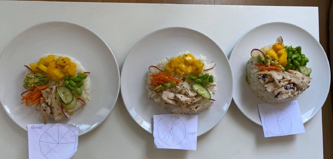
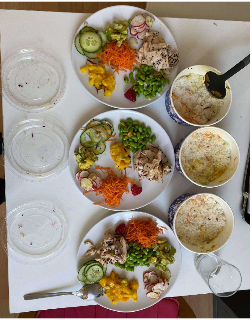
What socio-demographic criteria drive CO2 emissions? Which countries are the biggest emitters of CO2? Selecting 3 major countries, United States, France and China, the students used pokebowls of different heights to represent their level and types of Co2 emissions. Pokebowls are traditional Hawaiian dishes made with rice, raw fish, vegetables and fruit. In this way, each ingredient will represent the different sources of emissions and the height of the rice will represent the population of these different countries (the more rice, the more people). 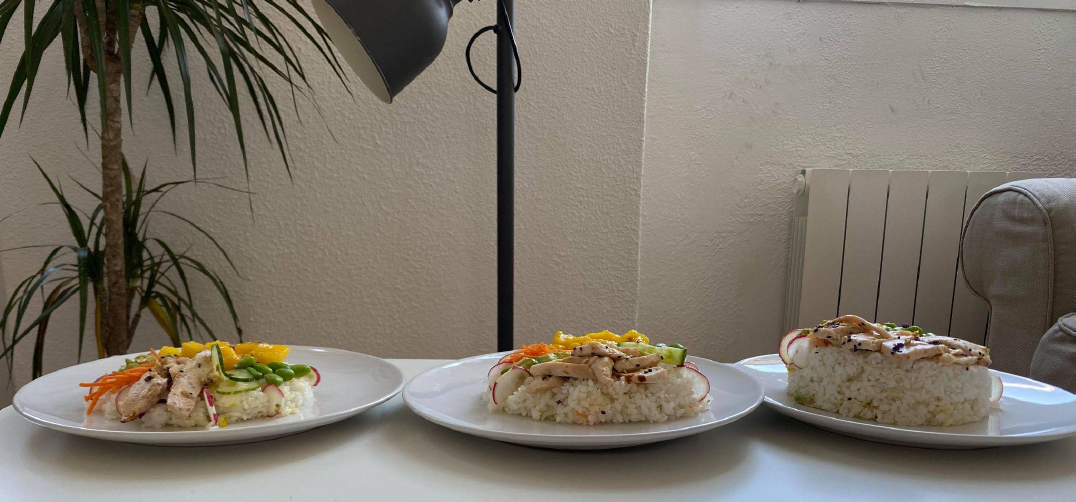
|
