Yet another year of very creative dataviz outputs. I'm always stunned and amazed by my student's creativity. Read on to discover how data can be turned into delicious food displays that we even get to enjoy!
Happy viewing & Bon appetit!
Happy viewing & Bon appetit!
|
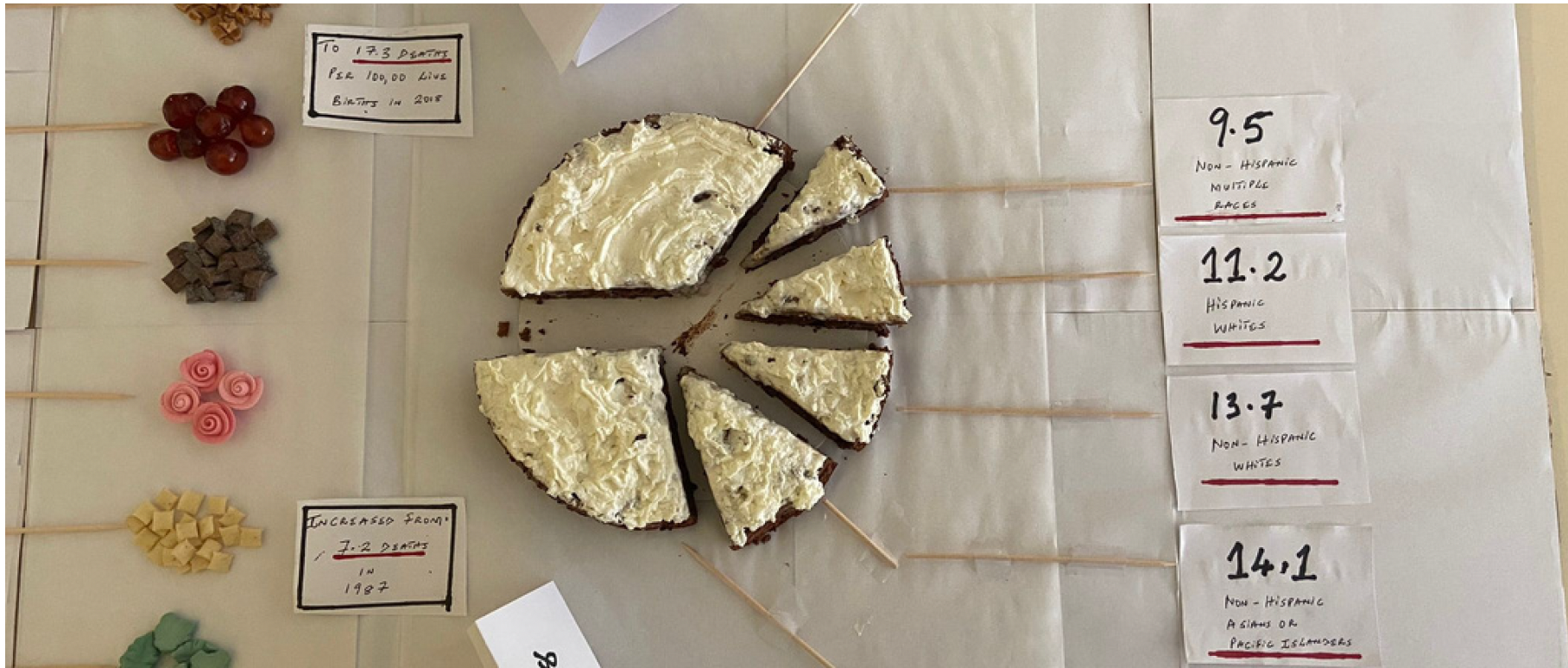
The taste of maternal mortality in the USA
This beautiful data cuisine project portrayed a very grave topic: women's maternal mortality. When discussions on the prevalence or increase of maternal mortality are brought up, it is usually in reference to countries in Africa, Asia and the Middle east. However, according to statistics, the steady increase of pregnancy related deaths in the past 2 decades in the Unites States is quite significant in comparison to other “first” world countries. Initially, the students wished to represent the mortality rates in the European Union but in the course of their research, decided to widen their scope to other high-income countries, in particular, the US. Given its history of inequalities, the students wished to investigate how systemic racism, class and social status played out in women's maternal mortality in the US. The questions they wished to answer were the following;
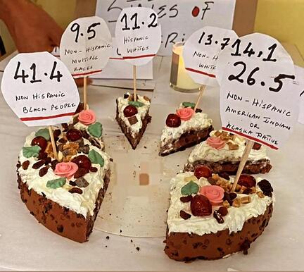
In comparison to other high-income countries, the US records deaths each year from causes that are being tackled effectively in several countries in Europe and in the UK. Even more disheartening is the fact that racial categories could determine the type of care, support and eventual fate of many people who want have children in the US. The accompanying video explains in more details how the women's maternal mortality cake was created and decorated. After treating the class to a very engaging presentation of this grave topic, the scrumptious cake was enjoyed by all.
|
How geographically diverse is the EJCAM population in 2022?
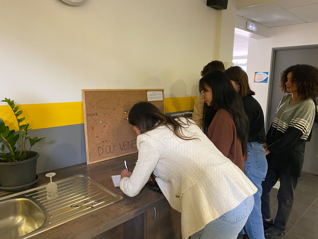
Marseille is a cosmopolitan city and an important entry port from the Mediterranean, where diversity is the watchword. This project wanted to check whether this diversity of provenance was reflected in the population of students and staff of the School of Journalism and Communication (EJCAM) where the students were enrolled in. The questions the dataviz project aimed to showcase were as follows:
The map was pasted on a board in the hallway of the school in a strategic location, in front of the coffee machine and an open space with tables where people usually sit to eat their lunch, thus ensuring maximum participation. The exhibit was left there for a week in October 2022. A total of 92 people participated. The photos and video below show the process and the resulting dataviz. 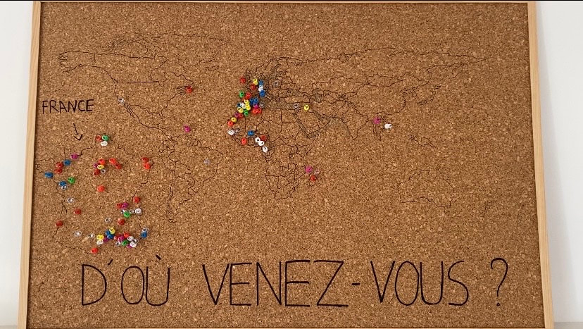
Unsurprisingly, the data gathered showed that the majority of EJCAM members in October 2022 were from Europe (65,62%) of which the majority (83.61%) were from France, followed by 3% from Germany, 3.28% from Spain, and 1.64% from the other six countries: Portugal, Switzerland, Belgium, Ireland, Italy and Poland. 27.08% of those who participated were from Africa and mostly from the Maghreb which is not surprising given its colonial ties France and the continuing relations. Surprisingly, Nigeria, an anglophone country that was formerly under British colony came in the third position with 11.54% while Senegal came fourth with 7.69%. The other countries represented were Tunisia, Cameroon, Madagascar, Comoros, Burkina Faso and Burundi. Asia represented 3.12% of the population of which 33.33% were from Vietnam. Only 3 people from the Americas (United States, West Indies and Saint-Pierre and Miquelon).
A second graph placed people according to whether they came from from urban and rural areas. The results showed that the vast majority lived in urban areas.
This participatory Urban Dataviz project showed, in a creative manner, a fact that would not have been immediately apparent: the diversity in terms of the places of origin of the people who work, teach and study at the EJCAM. Before this project, many believed that the vast majority of people at the school were from Marseilles. But through data gathering and this visual display, this preconceived idea was factually disproved. In the end, only three people were from Marseille. The majority came from the four corners of France and over 30 people came from continents other than Europe (Africa, America, Asia). It was brought home to the students just how many people had travelled across borders and oceans to pursue their studies at the EJCAM. Students were thus made aware of the multicultural and international setting they were evolving in and what it entailed in terms of openness and tolerance. |
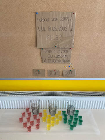
What do EJCAM students drink?
This project sought to visualise the drinking habits of students at the EJCAM. More precisely, it sought to gather data in a participatory manner to answer the following question: "When you go out, what do you drink most?
For the set-up, students wrote the instructions for the participants on cardboard cut-outs. They used transparent plastic cups to display different types of drinks. Each drink has a different colour, in line with its actual colour: beer was represented by a yellow syrup, wine a dark pink syrup and for soft drinks a green syrup. Three empty 50cl glasses were furnished to participants and around each of them a dozen shot glasses filled with syrup of the colour corresponding to the drink.
Participants were asked to fill the glass corresponding to their answer: beer, wine or soft drinks, and the aim was to illustrate the results by collecting different fluids.
Because of the nature of the material (glass and plastic cup and liquids), the experiment was run only during one afternoon and about 55 people participated, mainly students.
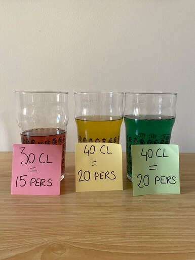
Out of a total of 55 participants: 27% drank wine, 36.5% drank beer and 36.5% drank soft drinks.
These findings should be taken with a grain of salt, as it represents only 55 EJCAM students, out of a total of more than 250. Unfortunately, for health and practical reasons, the experiment could not be carried out on a larger scale, but it can be concluded that 63.5% of the 55 students at EJCAM drink alcohol, which is just over half. Beer is the dominant alcohol (36.5% compared with 27% for wine), but the proportion of soft drinks remains high.
This project sought to visualise the drinking habits of students at the EJCAM. More precisely, it sought to gather data in a participatory manner to answer the following question: "When you go out, what do you drink most?
For the set-up, students wrote the instructions for the participants on cardboard cut-outs. They used transparent plastic cups to display different types of drinks. Each drink has a different colour, in line with its actual colour: beer was represented by a yellow syrup, wine a dark pink syrup and for soft drinks a green syrup. Three empty 50cl glasses were furnished to participants and around each of them a dozen shot glasses filled with syrup of the colour corresponding to the drink.
Participants were asked to fill the glass corresponding to their answer: beer, wine or soft drinks, and the aim was to illustrate the results by collecting different fluids.
Because of the nature of the material (glass and plastic cup and liquids), the experiment was run only during one afternoon and about 55 people participated, mainly students.
Out of a total of 55 participants: 27% drank wine, 36.5% drank beer and 36.5% drank soft drinks.
These findings should be taken with a grain of salt, as it represents only 55 EJCAM students, out of a total of more than 250. Unfortunately, for health and practical reasons, the experiment could not be carried out on a larger scale, but it can be concluded that 63.5% of the 55 students at EJCAM drink alcohol, which is just over half. Beer is the dominant alcohol (36.5% compared with 27% for wine), but the proportion of soft drinks remains high.
|
|
